More and more people are accessing the web through their mobile phones. Back in the day, there was that “View mobile site” link that would redirect website visitors to a page that had been
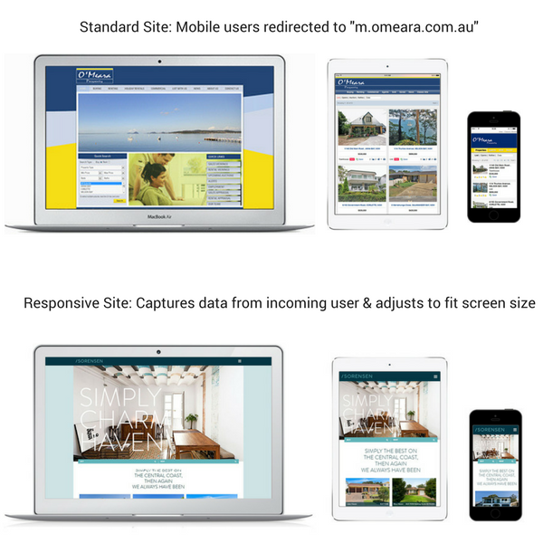 coded to fit a smaller screen. These days that doesn’t cut it. Besides the mobile & desktop site needing to be built differently, the sites won’t adapt to the many different sized screens appearing on the market now, and in the future.
That’s where responsive website design comes into play. Mobile, tablet, smart TV, wearable devices like Apple watches, are all able to display responsive websites with full content and usability. The coding done to make this possible is far more sophisticated and means that your site is ready for mobile and whatever comes ahead.
- Quick loading & self-adjusting images
- Easier form submission
- Google preference in search result ranking
As you can see, users are getting a similar experience on every device with an RWD website. This is important because the experience of your website tells your potential customers about your brand. Consistency across devices builds confidence in your company.
Not sure if your site is responsive? Check here.

Founding and operating digital web services businesses, Ryan has a passion for technology and over 10 years experience delivering online services to the classifieds verticals in Australia, New Zealand and Asia.