[shared_counts]
2 minutes read

Ouwens Casserly was built by Nathan Casserly and Alex Ouwens into one of Australia’s fastest growing independent residential property firms since it was established in late 2011. Ouwens Casserly specialise in making residential sales link back to sell, Projects to OC Projects, PM to Rent.

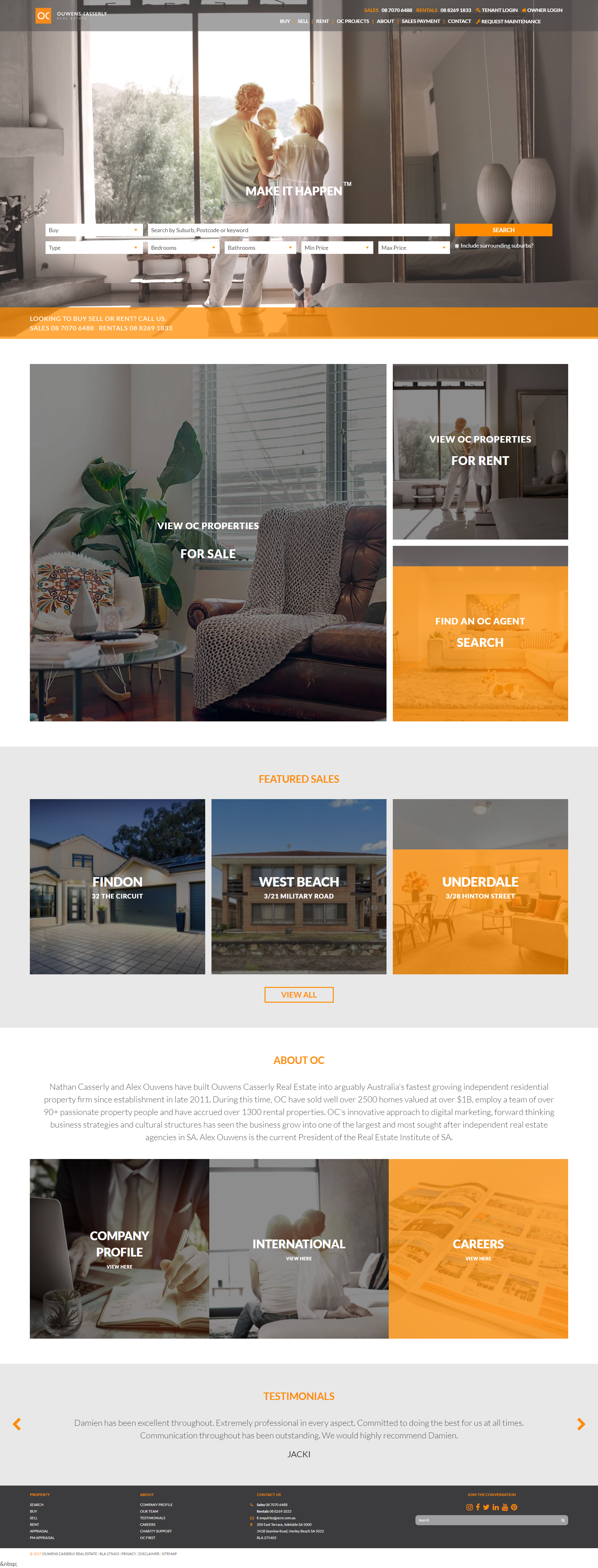
We made a complete transformation of their original site, giving a more modern and much more aesthetically appealing site layout. We did this with rotating imagery at the top, easy search navigation features followed by reduction of cluttering of their various sections and utilising imagery to give the site a more visual rather than textual focus.
Slideshow Feature
When people first access the site they are presented with a series of high definition product images which rotate in a slideshow. A great feature to have in a very visual orientated industry and immediately engages the audience. Here clients can see immediately that OCRE specialises in real estate focused around individuals, families etc.
Separate Search Bar
A separate search bar has been implemented under the slideshow. This is a step forward from it being embedded in the header bar along with products, contact etc and immediately draws the client in to search for their desired products or services rather than having to adjust themselves and navigate around the site.Here OCRE’s search bar has been broken up to better accommodate client searches, allowing them to refine their search and better find the products and information they are after.
Image Button Features
We removed the heavy amount of text that was used as tabs to separate products and services and instead utilised a grid structure of several images to serve as tabs. Engaging, visually telling, imagery serves as great way to not only display a product but serve as a quick and easy identification of different sections within a site. With OCRE most in demand tabs have been featured in separate sections and then broken down e.g. view or properties for sale, view our properties for rent and find an OC agent.
Consistent Colour Scheme
A great way to remember a brand or a logo is to use a memorable colour scheme. Cadbury, Nike, Realestate.com.au all use consistent colours and this effects our memory. Here we utilised OCRE’s trademark orange colour throughout the site in banners, interactive features with buttons, headers etc.
Looking to develop your website? Or maybe do a revamp and update like OCRE? Find out more about Responsive Websites or read about our solutions and give us a call on 02 9057 8040
[shared_counts]
