Responsive Websites
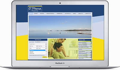
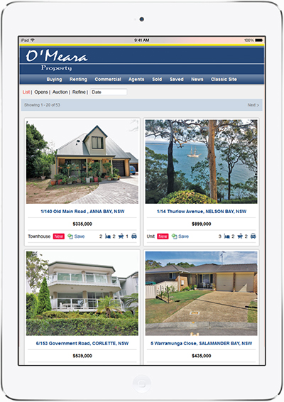
1. Traditional Method
The traditional development of websites for multiple devices meant building multiple sites with layouts to fit the varying screen sizes. In the example below, a desktop user would go straight on to omeara.com.au. An ipad or mobile user would be prompted to go to i.omeara.com.au or m.omeara.com.au (click the links to see what we mean). Although this worked ok, it requires 3 totally different websites to be coded, updated, hosted and ran through search engines. The result is more expense in the long run and a huge negative impact on your rankings in search engine results.

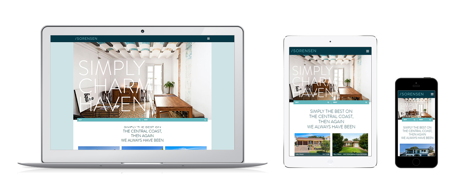
2. Responsive Method
If you look at this client www.sorensenre.com.au then you will see the site changes according to the device yet the user is not directed to another url for the Mobile or Tablet versions.
What are the Benefits of Choosing a Responsive Website?
| Traditional Mobile Site | Responsive Site | |
|---|---|---|
| User stays on 1 website | ||
| All content is optimised | ||
| Update content in 1 location | ||
| Removal of extra ongoing hosting fees | ||
| You own the site |
