For the month of January our feature site is Molenaar McNeice
Molenaar McNeice is definitely a modern Real Estate Agency that aims on having their knowledge, presence and ideas represent their brand. Because of this we have used a more innovative header feature on their homepage that showcases various scenes of Australian Living. In less than a minute the viewer can experience different elements of the Australian lifestyle, its unique appeal and difference from other brands.
This is very effective in drawing a client in as most of the time people tend to spend less than a minute browsing the front page before they decide to further browse the site.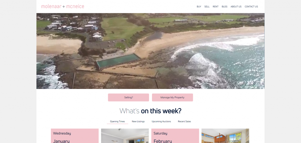
When creating a website it is important to understand the importance of what fits into each visible page as this affects the customers experience with the site and ultimately the brand. With Molenaar+McNeice the video has been intentionally scaled to cover only half of the visible page, allowing clients to see content relevant to their needs. Whether they are buying or selling, what is currently on and everything from open times to new listings.
Another lesser known but very effective feature to have in ANY website is a blog. Through a blog you are able to create original and industry relevant content. Why do this? By creating relevant and original content you are creating more opportunity for your site. You have brand relevant content to share on platforms, you increase your SEO potential with original content and metadescriptions and you are able to piggy back off trending topics and articles popularity when you write about them!
This is a feature we have incorporated into Molenaar+McNeice’s site. As they continue to generate content their digital presence has the potential to grow and strengthen!
With many different features it is important to make sure that your site does not seem crowded and overly busy. This is where the importance of white space comes in. With Molenaar+McNeice we have not extended the page to the end of the screen but have left a border around it. This gives the page some visual ‘breathing room’ and makes the page seem less busy. The same goes for the use of light weight text fonts throughout Molenaar+McNeice’s site. By using a font with decent spacing between letters and thinner line weight the page is less heavy in text and written content and is much easier for a client to read.
Interested in starting your website journey?
Get in touch with us on 02 9057 8040

Founding and operating digital web services businesses, Ryan has a passion for technology and over 10 years experience delivering online services to the classifieds verticals in Australia, New Zealand and Asia.